Artifice is the organization for experimental discipline: a curatorial research nonprofit in New York.
Brand guidelines and media kit. Boilerplate, logos, images and how to use them.
Name, facts and boilerplate
Use the name Artifice in running text. Use Artifice NYC, Inc. for legal lines and credits.
- Legal name
- Artifice NYC, Inc.
- Status
- 501(c)(3) nonprofit
- Founded
- 2024, New York
- Director
- Renaise Kim, Executive & Creative Director
- Archive
- index.artificenyc.org
- Social
- @artifice.nyc
- Contact
- info@artificenyc.org
Boilerplate
Use as written. For anything longer or different, ask.
Artifice is the organization for experimental discipline — a curatorial research nonprofit that gives experimental work a public stage and keeps the record of its making open.
Artifice is the organization for experimental discipline. A curatorial research nonprofit founded in 2024, it helps artists working with technology and science fiction make new work, show it, and keep a public record of how it was made. Its work runs in two modes: WHITEBOX, the lab, and BLACKBOX, the stage.
Artifice is the organization for experimental discipline. A curatorial research nonprofit founded in 2024, it supports emerging artists, researchers, and creative technologists working in creative science, installation, new media, and performance — through curatorial research, production environments, and a public archive. Two modes run through everything: WHITEBOX, the lab, where process is visible and materials are labeled; and BLACKBOX, the stage, where the same work is rendered as experience. Programs span public showcases (Chapters), research demos (nodes:), and editorial dispatches ([ ENTER ]). Underneath sits open creative infrastructure — a public record of how the work was made, kept open for anyone to read.
Marks and minimum sizes
The lockup is the parent mark. The hexagon stands for WHITEBOX, the asterisk for BLACKBOX. The cursive wordmark is fixed art. No live font matches it, so it is never re-set.




Minimum sizes, shown actual size


Below these the cursive closes up and the hexagon reads as a blob. In print, treat the same numbers as millimeters at 300dpi. Clear space on every side is the height of the hexagon.
Incorrect use
Use the supplied files. The mark is black or white, nothing else. Put it on near-black or on white, never on a mid-tone or over a busy part of a photograph.
Logo files
Every approved logo, in black and in white. Use SVG where you can and PNG where you can’t. Don’t modify the files. If the version you need isn’t here, ask.


























Black artwork is for light backgrounds, white for dark.
WHITEBOX and BLACKBOX
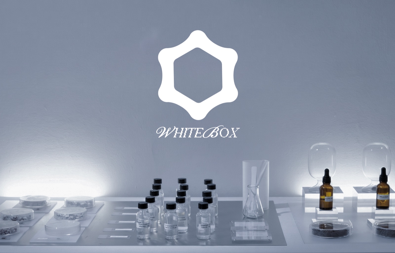
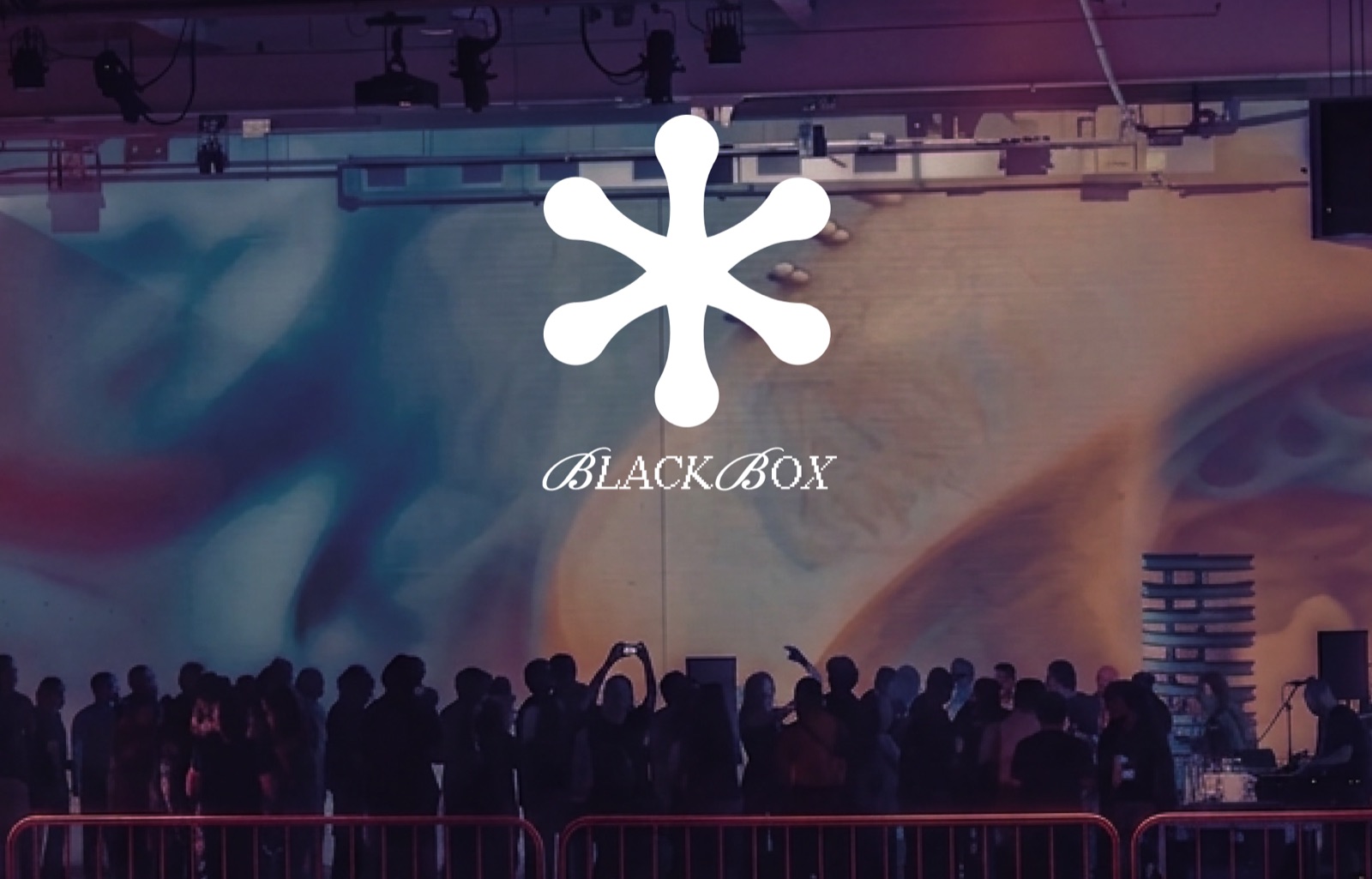
Every Artifice presentation is one or the other. WHITEBOX is the lab, BLACKBOX is the stage. The split is about what an audience is shown, not about medium or venue.
WHITEBOX
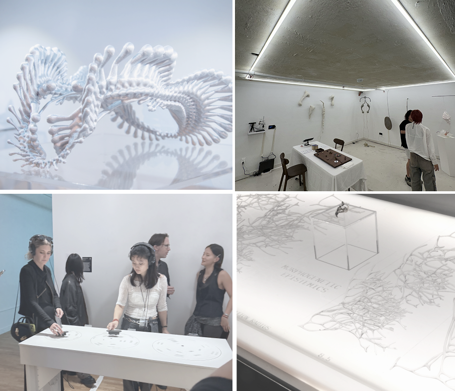
Work in development, shown while it is still being made. Rigs stay visible, materials stay labeled, and the maker is usually in the room. Even light, no blackout.
BLACKBOX
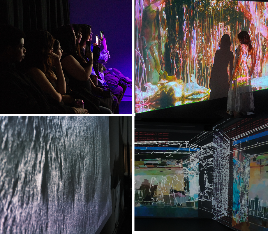
Finished work on a schedule. Performance, film and installation, run for an audience that arrives at a set time. Blackout, sound, projection.
A work can move from one to the other between programs. It is filed under whichever format it was presented in, one at a time.
Two grounds, one accent
Carbon and chalk carry every surface. Cobalt is the only accent: links and focus, never decoration.
Grayscale
Chalk at reduced opacity. The only grays.
Gradient
Grounds only. Never behind text.
One typeface: Helvetica Now Display
One family sets everything. Scale and case carry the hierarchy: sentence case for headings and body, uppercase for captions and labels. Body and headings are tracked −1%, display −2%, uppercase labels +8%. Never a weight swap to make a heading, never a second family. Redaction appears only where a title is set as display art.
Do
- Change size to change hierarchy.
- Keep lines to 45–75 characters, captions to 30–50.
- Rebreak a line rather than leave one word alone at the end.
Don't
- Set the cursive wordmark in a live font. It is art, not type.
- Add a bold weight to make something look important.
- Introduce a second family for captions or code.
Document the work and the room
Photograph what happened, in the light that was there. These are records first, so the rig, the cabling and the half-built version stay in frame.
Press images
Web resolution. For print files, write to info@artificenyc.org. Credit: Courtesy of Artifice NYC.
Do
- Shoot it as you found it, mess included.
- Use available light; let the blacks stay black.
- Run one image full-bleed rather than three small.
Don't
- Stock photography, or a room staged to look busy.
- Heavy grading, HDR, or pushed saturation.
- Collages that compete with the type on the page.
Chapters, nodes, [ ENTER ]
Three active formats. Same marks, color and type across all three. What changes is who is in the room.
Chapters
Public
A numbered public program of performance and installation. Chapter 006 is in production for winter 2027.
 nodes:
Practitioners
Development and demo nights for people building the work. Always lowercase, colon, roman numeral: nodes:ii.
nodes:
Practitioners
Development and demo nights for people building the work. Always lowercase, colon, roman numeral: nodes:ii.
Brackets
- Named platforms and publications: [ ENTER ].
- Named works, exhibitions and episodes.
No brackets
- Generic nouns: artifact, program, chapter.
- The organization's name, or anyone's name.
- WHITEBOX and BLACKBOX. The uppercase already does it.
Describe the work rather than praise it
Write as though the reader knows the field. Name the material, the place, the number. The warmth is in what you noticed, not in adjectives.
We're excited to announce a groundbreaking immersive experience at the intersection of art and technology.
nodes:ii ran on April 11, 2026, in the studio space of Onassis ONX in New York. Each work was shown mid-build, with its maker at the bench.
Do
- Lead with the material: koji in a lab, resin priced against rare earths.
- Give the number, the date and the room.
- State it once, plainly, and stop.
Don't
- "Excited to announce," "groundbreaking," exclamation points.
- Short declarations stacked to sound like a manifesto.
- Investor language: "spatial intelligence," "the future of."
- A second metaphor to explain the first.